
The problem we were trying to solve
Originally, timetracker users relied on a single Monthly View built mainly for review, not interaction.
Users could see their time, but adjusting or creating worklogs was slow and fragmented, especially for users managing larger volumes of time.
There was no view that allowed users to work directly with their time in a flexible, day-by-day way. As time tracking became a more frequent, hands-on activity, these limitations became harder to ignore.
We wanted to answer a simple question:
What if users could focus on smaller timeframes and interact directly with their time, using intuitive actions like clicking, dragging, and duplicating worklogs instead of filling out forms?

How the solution evolved
Early exploration focused on enabling direct interaction with time while keeping the timeframe manageable and the view easy to understand.
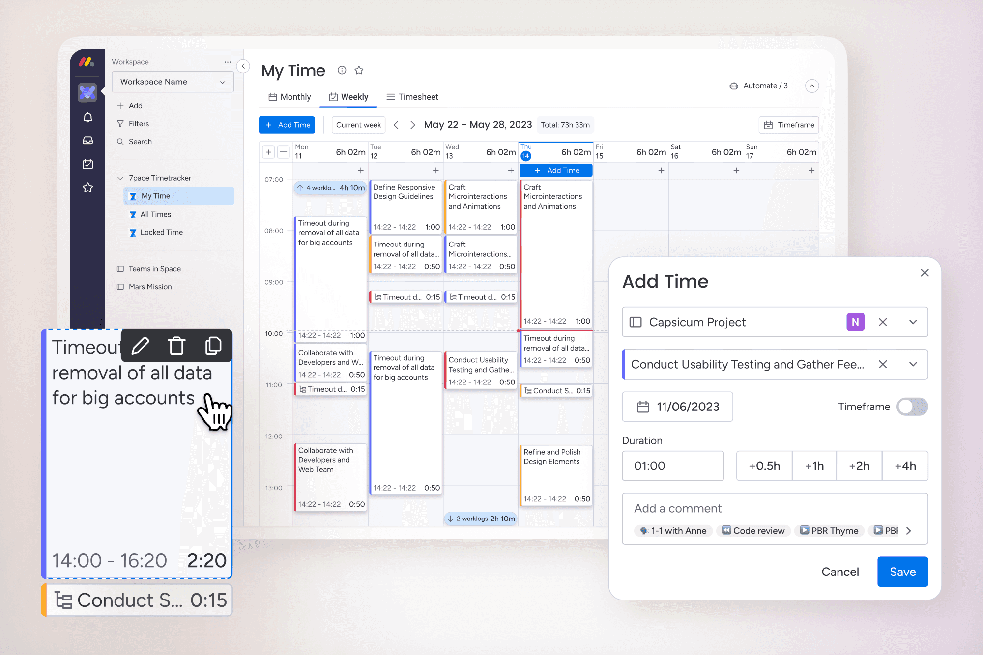
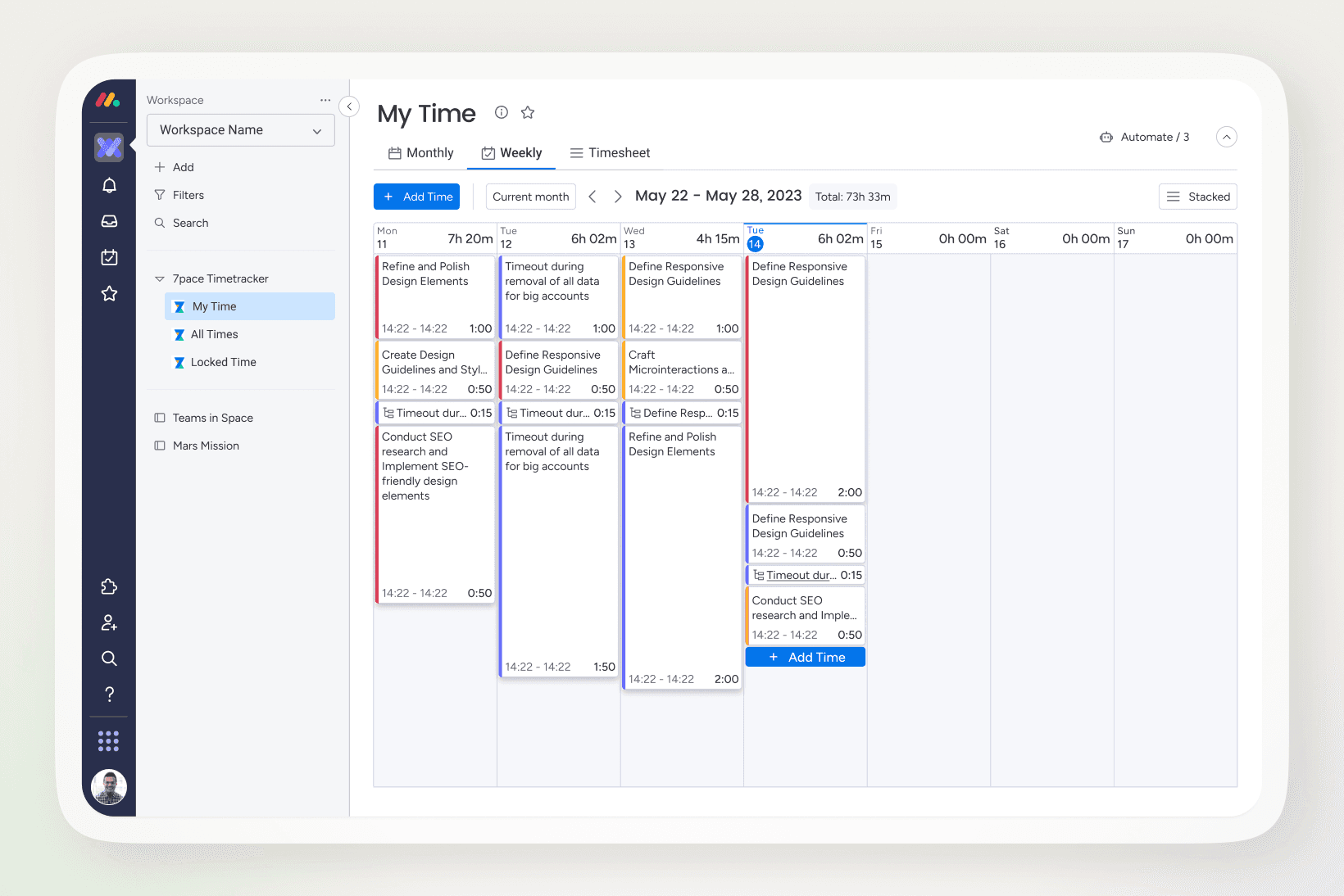
The first step was introducing a new Weekly View focused on hands-on interaction.
Users could now:
Create worklogs by clicking directly in a specific timeframe
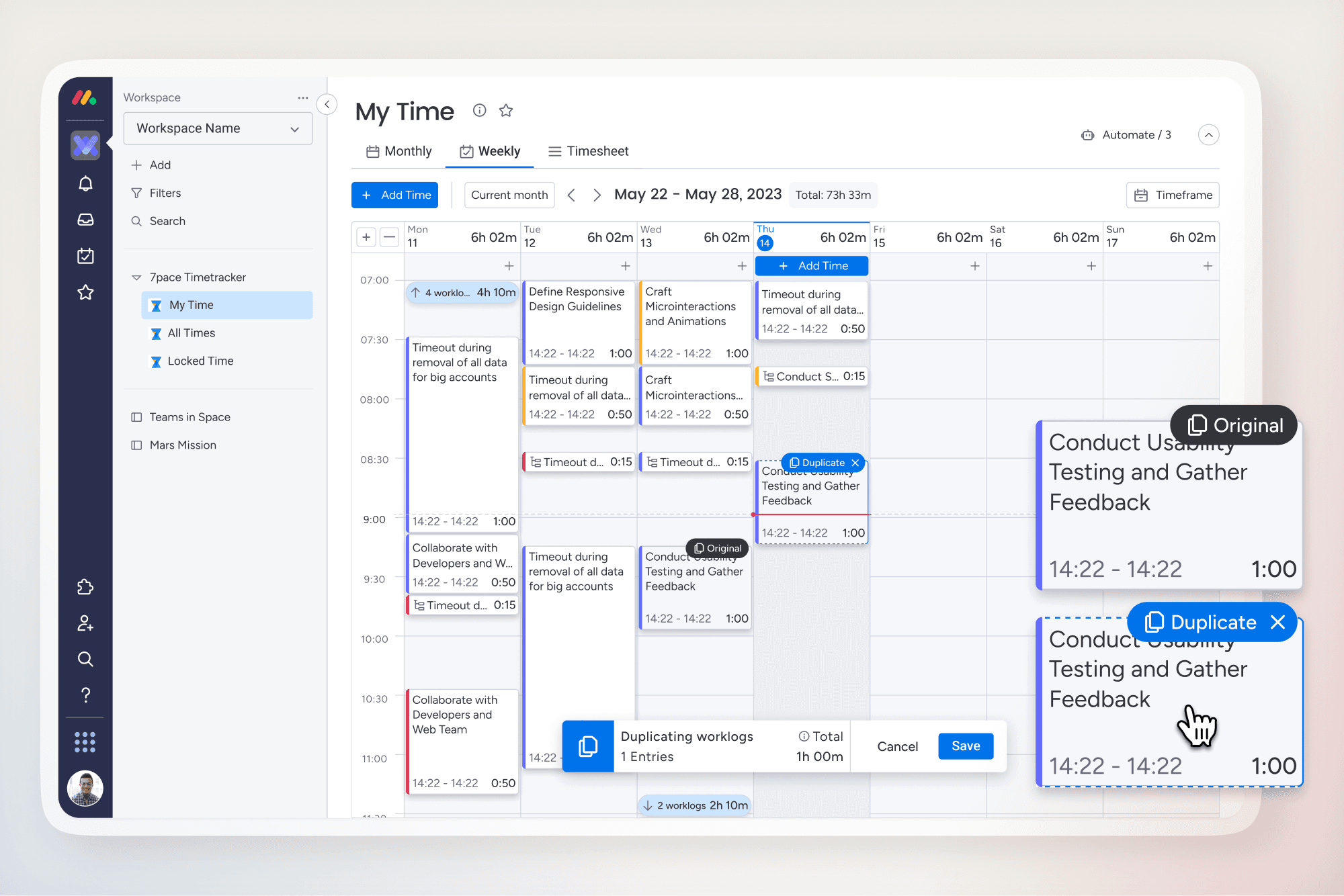
Drag entries between days to adjust logged time
Duplicate time across weekly days to reduce repetitive work
This allowed users to focus on smaller timeframes while working directly with their time instead of filling out forms.
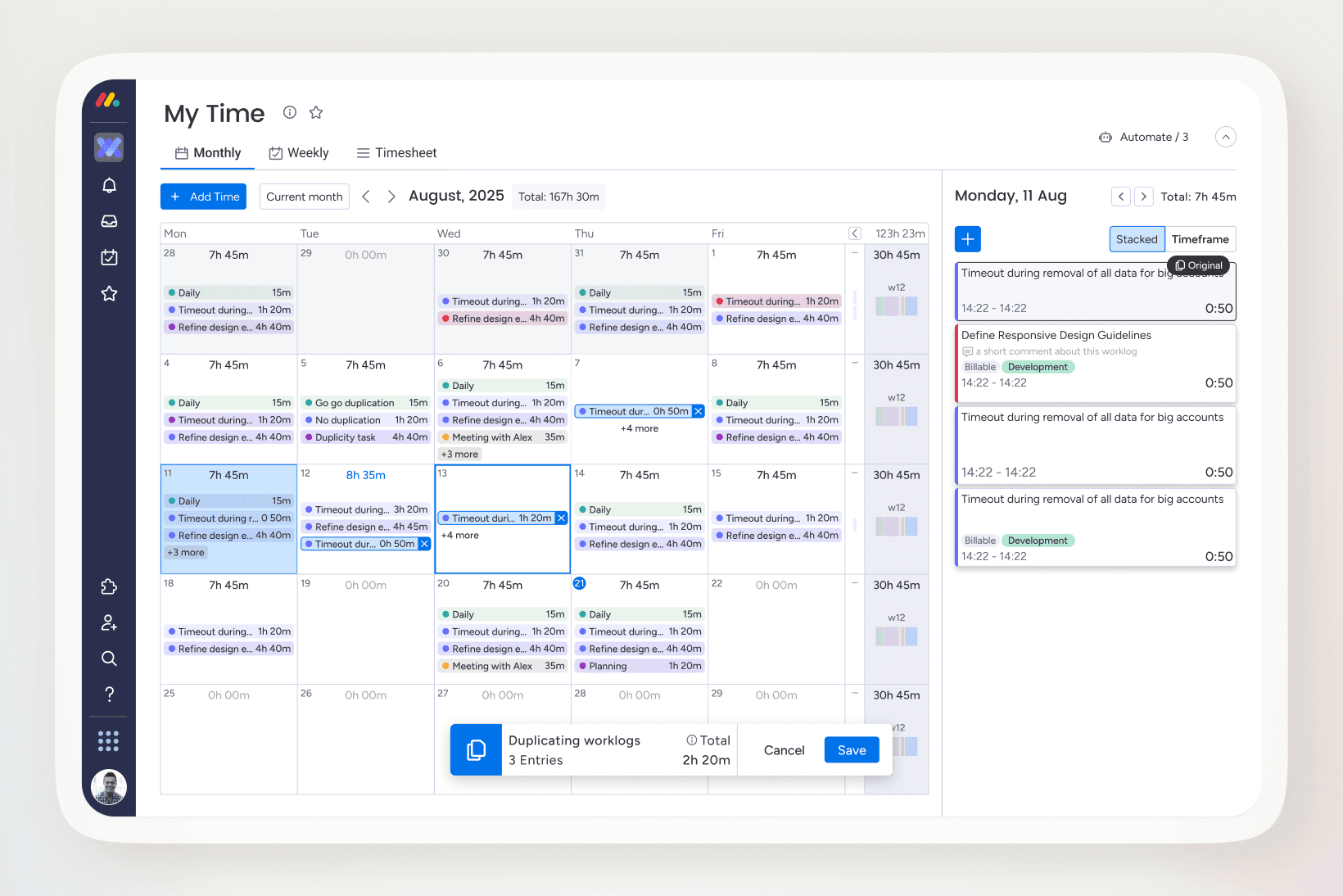
With the Weekly View established, the Monthly View was redesigned to build on the same interaction model.
Key refinements included:
Reusing drag and drop for resizing logs
Supporting click-and-drag creation at a broader scale
Adding duplication to speed up recurring adjustments
Introducing a detailed day panel for deeper edits without leaving the view
These changes aligned both views around the same interaction principles while supporting different levels of time granularity.

The result is two complementary views:
Weekly View for fast, hands-on time entry
Monthly View for broader overview with the ability to drill into daily details
Both share the same interaction patterns, making it easy to move between them and keeping the experience consistent across the application.


Outcome
On newer platforms like monday.com and Jira, the Weekly View became the primary way users logged time, shifting behavior toward more direct, hands-on interaction with worklogs.
The redesigned Monthly View complemented this by improving retrospective time tracking through richer interactions and greater control, while on legacy platforms the Weekly View added flexibility without forcing users to abandon existing workflows.
What this project reinforced
Interaction beats configuration
Users preferred working directly with their time over filling out forms or navigating settings.
Smaller timeframes increase control
Focusing on days and weeks made time entry feel more manageable and less overwhelming.
Consistency enables scale
Sharing interaction patterns across Weekly and Monthly views reduced relearning across platforms.